Probably everyone, when creating clothes or choosing a wardrobe, thought about color combinations of fabrics. This is very important, since the right colors of clothing create harmony with your own color.
To select the correct color, designers and stylists use Itten’s color theory. This theory is useful for everyone to know so as not to limit their choice of clothing. Itten’s theory is also used by interior designers, artists, and photographers.
So, before you is the Itten circle. It consists of three groups of colors:
Group 1: primary colors (red, yellow, blue) - these colors exist independently in nature, all other colors are derived from them;
Group 2: secondary colors are a mixture of two primary colors (orange, green, purple);
Group 3: tertiary colors are a mixture of primary and secondary colors.
Exists four groups of color combinations:
1. Related colors(analog) – any three colors located side by side in a ¼ circle.
2. Contrasting colors– diametrically opposite colors on the color wheel. These are bright combinations, dynamic, moody, cheerful.
3. Related-contrasting combinations– located in two adjacent quarters of the color wheel. For example, blue-green and yellow-green are related because they are connected by one of the main colors (pure green), and at the same time they are contrasting: they contain admixtures of additional ones - blue and yellow.
There are 4 groups of related-contrasting colors:
1) yellow-red and red-blue;
2) red-blue and blue-green;
3) blue-green and green-yellow;
4) green-yellow and yellow-red.
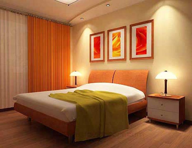
An example from the interior, but the same can be done in clothes:

4. Monochrome colors- This is one color of different lightness.
Types of colors.
1. Chromatic (colored).
2. Achromatic (white, black, gray).
Color perception.
The black background makes the color pop.
A white background makes the color darker.
Orange makes red look dull.

Characteristics of color.
There are 3 color characteristics:
2) saturation;
3) lightness.
Color background- the main characteristic of color. Divided into warm and cold tones. Warm colors are reminiscent of summer, sun, fire. Cold - winter, ice, water.

In this figure, they are divided into warm and cold colors on the Itten circle, but each of their colors can be made warm or cold: if we add black to the main color, the color will become warmer, and if white, it will become colder. You can also add yellow to the main color - you get a warm color, or blue - you get a cool color.
Or the brightness of a color is determined by two characteristics:
- bright color;
- muted color.
Gray color creates muted shades:

- This is the depth of color, as opposed to white or black.
White – brightens the color, gives softness, pastel.
Black color makes the color dark, heavy, and takes away the brightness.

Features of color.
Reduce, distance - cold, dark, matte.
They enlarge, bring closer - warm, light, shiny, pearlescent.
Based on this, we can write about the properties of the fabric:
- shiny fabrics (satin, satin) – reflect light (plump);
- matte fabrics (wool) – absorb light (make them thin).
Harmonious color combination:
Red – green, gray, blue.
Bordeaux – black, blue, beige.
Orange – violet, pale blue, bright blue.
Yellow – purple, blue, green, brown.
Dark green – brown, beige.
Pale green – dark green, gray, purple.
Purple – light and dark shades of green, yellow.
Brown – orange, red, beige, gray.
Blue – red, gray, burgundy, orange yellow.
Pink - blue, burgundy, brown, gray.
Blue – red, brown, blue, orange, light purple.
To be continued...
Combinations of related and contrasting colors represent perhaps the most extensive type of color harmonies. In the color wheel system, related and contrasting colors are located in adjacent quarters. These are warm yellow-red and yellow-green colors, cool blue-green and blue-red colors, warm yellow-green and cold blue-green colors, warm yellow-red and cool blue-red colors. In total, as you can easily see, we have four groups of related and contrasting colors.
Let's take a closer look at the colors of the first group - yellow-red and yellow-green. On the one hand, they carry a sign of relatedness, since both have a certain amount of common pure yellow color: They are all somewhat yellowish compared to other colors. At the same time, in the yellow-red colors there is pure red in different quantities, and in the yellow-green group there is a pure color, contrasting and complementary to the red color. Thus, these colors to a certain extent carry a sign of contrast.
Harmonic combinations of related and contrasting colors of different groups are characterized by increased color activity and complexity.
Not all combinations of related and contrasting colors are equally harmonious. Particularly harmonious are the color combinations that are located in color wheel at the ends of vertical and horizontal chords (in Fig. 2 several such chords are shown by dotted lines). This is explained by the fact that there is a double connection between such pairs of related-contrasting colors: they consist of the same amount of the unifying main color and the same amount of contrasting colors.
Rice. 2.
Artistic practice shows that related-contrasting colors, even in their pure form, without admixtures of achromatic colors, are harmoniously combined with one another, provided that the amount of the unifying main color and the number of contrasting main colors in the two colors being combined are the same. But the artist more often deals with colors of more complex shades, whitened or darkened. The feeling of emotional expressiveness of related and contrasting colors naturally changes depending on which color wheel the colors for combinations are chosen from.
The simplest harmonious combination of two related and contrasting colors is significantly enriched when one achromatic color is added to them, especially white or black. Similar to the above, another solution is when colors from the shadow rows of these colors are added to the combination of two related-contrasting colors.
In the latter case, we have one of the types of harmonious combinations of two shadow rows of related and contrasting colors. In general, these harmonic combinations are divided as follows:
two pure related-contrasting colors, which are complemented by the colors of the shadow row of one of the combined colors;
two pure related-contrasting colors, complemented by colors from both shadow rows; one pure and the rest from the shadow rows of related and contrasting colors.
In this case, it is advisable to surround a pure color with the colors of the shadow row of a given color, and take the rest from the shadow row of a different color and place them at some distance;
All related-contrasting colors are either darkened or whitened (harmony takes on a more restrained coloring, since the polar properties of the colors are softened).
We emphasize: only three, at least three colors allow us to fully judge the combinations and relationships of colors in an ornamental composition. In this regard, let's name some other harmonic connections of 3-4 colors.
Color harmony can be formed by a combination of colors located at the vertices of an equilateral triangle inscribed in the color circle. This triangle has one of its sides parallel to the horizontal or vertical diameter; in the vertex opposite the indicated side there is a main color, contrastingly complementary to the main color that is part of a pair of related contrasting colors (Fig. 3). In the color wheel we have four such equilateral triangles, in the system of five circles we have 20.

Rice. 3.
In each triad of colors, two related and contrasting colors are balanced by a double connection of unifying and contrasting main colors. It is better to darken or whiten the third main color.
Another type of harmonious combinations of three colors: two related and contrasting colors and the third color - the main one - combines the first two colors. For example in Fig. Figure 4 shows several corresponding triangles.

Rice. 4.
To give greater harmony to the combination of colors of this triad, you can reduce the amount of pure main color by darkening or highlighting it.
Another type of harmonic triad is formed by colors located at the vertices of right triangles, provided that the two legs connect pairs of related and contrasting colors (the legs are parallel to the horizontal and vertical diameters of the color wheel). In Fig. Figure 5 shows two such right triangles. In each of them, the color that is located at the vertex opposite the hypotenuse is related and contrasting in relation to two other colors, and the latter, in turn, are related to each other by contrasting relationships. A total of four such triangles can be constructed in one color circle, and 20 in a system of five circles.

Rice. 5.
Combinations of four related-contrasting colors form on the base of a rectangle, each side of which connects two related-contrasting colors (Fig. 6).

Rice. 6.
The closest and most active connections occur between colors when the rectangle is replaced by a square. Colors located diagonally in a rectangle or square are contrasting and complementary (other pairs of colors are related and contrasting).
Harmonic connections of related-contrasting colors from the three and four components of the main color wheel are used relatively rarely in practice. Artists prefer combinations of related and contrasting colors from the color wheel system. Firstly, all the types of harmonic combinations discussed above remain valid for any darkened or lightened color wheel. Secondly, any three or four related-contrasting colors can be combined with the colors of the shadow rows of any of these related-contrasting colors.
Concluding this paragraph, we note that it is in combinations of related-contrasting colors that two basic principles for constructing color harmonies are fully and clearly manifested: the principle of uniformity and identity of colors and the principle of contrasting color tones.
The harmony of related colors is based on the presence in them of an admixture of the same main color.
This is a relatively restrained color scheme. For example, on our color wheel these are red and red-orange, yellow and yellow-red, but not red and yellow. That is, related colors are colors taken from the intervals from a given color to the next main one.
In the color wheel, or more precisely, in the color wheel system, there are 4 groups of related colors: yellow-red, blue-red, yellow-green, blue-green.
Let's look at how you can harmonize three related colors - pure red, red-orange and orange. To achieve harmony in a given color combination (and this is a balance of shades), it is necessary to balance the colors by changing their saturation or lightness. Thus, equally saturated color tones of the same lightness cannot form subtle color combinations. But if you add a darkened or highlighted color to one or two colors out of three, the colors begin to combine harmoniously, focusing attention on the third, most saturated color.
 Related-contrasting colors are located in two adjacent quarters of the color wheel at the ends of the chords (that is, lines parallel to the diameters) and contain one common color and two other color components, for example, yellow with a red tint (yolk) and blue with a red tint (violet). These colors are coordinated (united) with each other by a common (red) shade and are harmoniously combined. There are 4 groups of related-contrasting colors: yellow-red and yellow-green; blue-red and blue-green; red-yellow and red-blue; green-yellow and green-blue.
 Related-contrasting colors are harmoniously combined if they are balanced by an equal amount of the common color present in them (that is, red and green colors are equally yellowish or bluish). These color combinations look sharper than related ones.
Lesson #6.
Taking into account the color system to create a harmonious composition. Contrast and nuance.
Color harmony- this is the consistency of colors among themselves as a result of the found proportionality of their areas and shapes, balance and consonance, based on finding a unique shade of each color. This harmony should evoke certain positive feelings and sensations in a person.
Harmonic combinations, according to the nature of psychophysiological perception, they are usually divided into five color groups: monochromatic harmonious combinations of colors, harmonious combinations of related colors, harmonious combinations of contrasting colors, harmonious combinations of related-contrasting colors and harmonic combinations “Triad”.
The first thing we have to get acquainted with is the classification of colors. What colors can we name right away? Basically, these are the basic colors that children draw in the rainbow, and so that it would not be so difficult for us, let’s work on these rules specifically for them. EVERY HUNTER WANTS TO KNOW WHERE THE PHEASANT SITS – sound familiar? Certainly! This is the rule for which color follows which on the color wheel. And it looks like this:
There are more complex color wheels, for example:

First group harmonious colors This:
Monochrome (one-color) harmonic combinations built on the basis of one color. On a more complex circle, the scale will be one color and will be a monochrome harmonious combination. They are created by combining a chosen color with its light and dark shades, obtained by adding white and black. As a result, you can achieve, on the one hand, a strong tonal contrast, and on the other, subtle color relationships. The overall color tone gives monochromatic combinations a calm, balanced character.
For example, color palettes used by designers:


The second harmonious combination is related (analogous) harmonic colors, the name already makes it clear that the colors are “relatives”, these are those colors that are located next to each other in the color wheel, for example:

In designer palettes it looks like this:
Due to their proximity, these colors are easy to combine. This harmony can have a lot of depth, it is characterized by rich originality and an elegant appearance. The harmony of related colors is based on the similarity of color tones and evokes a feeling of balance and calm. Even with a slight tonal contrast, the color unity of paints always maintains internal stability and nobility.
Third group: harmony of contrasting (complementary, opposite) colors are created by using two colors that are opposite each other on the color wheel.
This technique is usually used to create accents, since combinations of these pairs of colors have the greatest color contrast, causing an active sound, tension and dynamism of the composition. This allows one color to complement another in such a way that one is the focal point while the other is the background. When using such a combination, it is very important to maintain proportions when there is much more background color and its sound is less significant than the dominant color accent on its background.
Let's look at examples of such a combination
One color is leading, the remaining colors surround it and their number by mass is much greater.
There is a more complex combination of harmonious contrasting colors according to the principle "Triad". This is a type of harmonious combination of contrasting colors of four colors, in which there are two pairs of colors located opposite each other. There are also various harmonious combinations colors based on a rectangle (four harmonious colors) and a pentagon (five harmonious colors), however, such combinations are only allowed for experienced designers.

When working with such a combination, you need to understand that this is the strongest sound of almost all colors, and you can balance such a gamut by immersing them in an environment where they would not interfere with each other, but remain full (equal in sound), such combinations look good against a very light background or in a dark environment.
The concept is often used "Triad". This harmonious combination is based on three colors of the color wheel that are equidistant from each other. These colors exhibit very distinct and strong color combinations, but are the most difficult to create correctly. To achieve harmony in a triad, one color is taken as the main color, and the other two are used for accents.

This scheme is popular among artists because it offers strong visual contrast while maintaining balance and color saturation. This composition looks quite lively even when using pale and desaturated colors. But in fact, these principles are very complex, they need to be approached carefully so that you don’t end up with a “psychedelic vinaigrette” in which a person will feel uncomfortable.
The fourth group is harmonious combination of related and contrasting colors. The most common type of color harmonies, forming an isosceles triangle on the color wheel. Here harmony is achieved through the use of a color and colors adjacent to its complement. These colors are softer than simply combining two complementary colors. Characteristic feature drawing up harmonious combinations of related and contrasting colors is the priority of related colors, where the additional (opposite in the circle) color is present in the composition by no more than 10-20%. This combination is one of the most expressive, complex and deep. You can admire them endlessly.
All colors are divided into two categories: warm and cold. Cold ones are based on blue-blue shades, and warm ones, in turn, are yellow-red.
Warm:


They can be called in general related flowers, and create harmonious combinations according to the four principles listed above.
Cold:


Cool colors can also be designated as related.
And one more point: colors, or rather their shades, can be classified as a group of completely opposite colors. Thus, pink, which initially can be classified as a warm color, can be a cool color in a certain shade, for example:
And there are a lot of such examples, even the warmest color yellow can be cold in a certain shade, such miracles are found in the world of color!
The main thing is to know that any harmonious composition is built either on the principles of contrast (contrast of colors, tones) or on the principles of nuance (monochrome or uniform color combinations).
 Contrast |
 |
Contrast- this is a strongly pronounced difference in properties, both the color of the material and the spatial forms, given in their comparison. For example, light - dark, high - low, large - small. Nuance means a subtle transition and characterizes slight differences in the properties of colors that have similarities. In landscape art, it is especially interesting to use the color nuances of plants, selected for summer, autumn effects or for a given color scheme.
In the landscape, when working with color, it is important to consider:
That in order to visually enlarge a small area, it is necessary to abandon a wide variety of color combinations and bright contrasts;
That the blue tones of plants placed in the background will visually increase the size of the area;
That a large proportion of green in the garden allows you to use a variety of tones and colors when creating compositions;
That bright, contrasting compositions should be balanced by a calm background and make up 10-15% of the total selected color tone.
When starting to create any composition, be it a composition of trees and shrubs or herbaceous plants (perennials, annuals), you need to decide on the color, look at the color wheel again and do not forget about the shape of the plant material and its texture. As Tatyana Koisman, an expert on creating flower beds, advises, we repeat “... like a spell: color, shape, texture; color, shape, texture..."

Related colors - harmonious flower garden

Related colors - flower garden on nuances

Related colors - bright flower garden

Opposite colors - contrasting composition

Monochrome composition of one color

Monochrome composition based on one tone.
Runge also included white and black among the primary colors, which in the three-dimensional model of the color system he proposed are located at the poles of the ball. Along the equator of the ball, Runge placed optimally saturated colors; he considered changes in color along the meridians towards the poles as modifications in lightness, and changes in each color tone towards the axis of the ball showed changes in saturation.
Related-contrasting harmonic combinations in a circle. How many groups are there? Which? Examples.

Combinations of related and contrasting colors represent perhaps the most extensive type of color harmonies. In the color wheel system, related and contrasting colors are located in adjacent quarters.
In total, as you can easily see, we have four groups of related and contrasting colors.
warm yellow-red and yellow-green,
cold blue-green and blue-red,
warm yellow-green and cool blue-green,
warm yellow-red and cold blue-red.
Let's take a closer look at the colors of the first group - yellow-red and yellow-green. On the one hand, they carry a sign of kinship, since both have a certain amount of pure yellow in common: they are all to some extent yellowish in comparison with other colors. At the same time, in the yellow-red colors there is pure red in different quantities, and in the yellow-green group there is a pure color, contrasting and complementary to the red color. Thus, these colors to a certain extent carry a sign of contrast.
Harmonic combinations of related and contrasting colors of different groups are characterized by increased color activity and complexity.
Not all combinations of related and contrasting colors are equally harmonious.

Combinations of colors that are located in the color wheel at the ends of vertical and horizontal chords are especially harmonious (in Fig. 22 several such chords are shown with dotted lines; the designations of colors in the color wheel are the same as in Fig. 20, 21). This is explained by the fact that there is a double connection between such pairs of related-contrasting colors: they consist of the same amount of the unifying main color and the same amount of contrasting colors.
Rice. 22. Scheme of harmonious related-contrasting color combinations (along the chord)
Artistic practice shows that related-contrasting colors, even in their pure form, without admixtures of achromatic colors, are harmoniously combined with one another, provided that the amount of the unifying main color and the number of contrasting main colors in the two colors being combined are the same. But the artist more often deals with colors of more complex shades, whitened or darkened. The feeling of emotional expressiveness of related and contrasting colors naturally changes depending on which color wheel the colors for combinations are chosen from.
Consider, as an example, the combination of yellow-green color 22 from the main circle and 4 from circle 1 (see Fig. 20, 21, 22). The orange shaded color contains less pure yellow compared to the yellow-green of the main circle. According to the previously accepted condition, in order to create the most harmonious balance in the combined colors, it is necessary to whiten the yellow-green color 22 somewhat, which will reduce the amount of pure yellow and pure green in it, weakening its saturation.
However, it should be taken into account that the balance of color in this way will be associated with an increase in its lightness.
If this fact is undesirable in the composition, you can add such an amount of black to the overly lightened yellow-green color so that the colors are visually harmoniously balanced.
Note that in the practice of artistic creativity it is relatively rare to encounter compositions that contain only two colors. This is understandable: two colors cannot form a proportional relationship. The simplest harmonious combination of two related and contrasting colors is significantly enriched when one achromatic color is added to them, especially white or black. Similar to the above, another solution is when colors from the shadow rows of these colors are added to the combination of two related-contrasting colors.
In the latter case, we have one of the types of harmonious combinations of two shadow rows of related and contrasting colors.
In general, these harmonic combinations are divided as follows:
two pure related-contrasting colors, which are complemented by the colors of the shadow row of one of the combined colors;
two pure related-contrasting colors, complemented by colors from both shadow rows;
one is pure and the rest are from shadow rows of related and contrasting colors.
Color harmony can be formed by a combination of colors located at the vertices of an equilateral triangle inscribed in the color circle.

This triangle has one of its sides parallel to the horizontal or vertical diameter; in the vertex opposite the indicated side there is a main color, contrastingly complementary to the main color that is part of a pair of related contrasting colors (Fig. 23). In the color wheel we have four such equilateral triangles, in the system of five circles we have 20.
Rice. 23. Scheme of harmonious related-contrasting color combinations (along an equilateral triangle)
In each triad of colors, two related and contrasting colors are balanced by a double connection of unifying and contrasting main colors. It is better to darken or whiten the third main color.

Another type of harmonious combinations of three colors: two related and contrasting colors and a third color - the main one - combines the first two colors. For example in Fig. Figure 24 shows several corresponding triangles.
Rice. 24. Scheme of harmonious related-contrasting color combinations (along an isosceles triangle)
To give greater harmony to the combination of colors of this triad, you can reduce the amount of pure main color by darkening or highlighting it.

Another type of harmonic triad is formed by colors located at the vertices of right triangles, provided that the two legs connect pairs of related and contrasting colors (the legs are parallel to the horizontal and vertical diameters of the color wheel).
In Fig. Figure 25 shows two such right triangles. In each of them, the color that is located at the vertex opposite the hypotenuse is related and contrasting in relation to two other colors, and the latter, in turn, are related to each other by contrasting relationships. A total of four such triangles can be constructed in one color circle, and 20 in a system of five circles.

Rice. 25. Scheme of harmonious related-contrasting color combinations (along a right triangle)
Combinations of four related-contrasting colors form on the base of a rectangle, each side of which connects two related-contrasting colors (Fig. 26)..
Colors located diagonally in a rectangle or square are contrasting and complementary (other pairs of colors are related and contrasting).
Harmonic connections of related-contrasting colors from the three and four components of the main color wheel are used relatively rarely in practice. Artists prefer combinations of related and contrasting colors from the color wheel system.